Soft opening, redux...
One of the more popular front-page pieces I've done at The Delver's Dungeon was a review of the reissues of the original three Advanced Dungeons & Dragons 1st edition rulebooks. Announced in January of 2012, then finally released in July of that year, they were (for me) the high water mark of Wizards of the Coast's opening up of D&D to reach out to its older audience, fans of older editions. I believed then (and believe now) in rewarding good corporate behavior so of course I picked up a set as soon as they were released, and covered them in an article showcasing differences between the books as they were when originally released and as they were now. Since then, there have been re-releases of Unearthed Arcana, eight classic 1e AD&D modules in two separate bound hardbacks, a boxed collector's edition of original D&D, the complete run of 2nd edition AD&D's rulebooks, as well as 3rd edition's core rules (well, "3.5th edition", however you would pronounce that). Despite having played a good deal of it alongside AD&D in the 2000s, 3.5 never interested me much. Certainly not enough to purchase a set of rulebooks for it. Likewise 2e doesn't interest me much at all. I snapped up a boxed Original D&D set, and will review it very soon (although I did get it last year). Below is the original July 2012 overview of the Advanced Dungeons and Dragons rulebook re-releases, now with a view of Unearthed Arcana.
Without further ado, the overview (click for larger images).
The books themselves came shrink-wrapped. This was a nice touch that ensured they'd arrive in near-flawless condition. I found it a bit onerous thinking about the books then being on a game-store (or large bookstore) shelf and generally inaccessible to browse, but given that there's some nudity that may have been a prudent move on Wizards of the Coast's behalf. It also preserved the book-wraps, seen below (after removal):

Regarding the covers themselves, I'm of two minds. On the one hand, the three cover paintings are of course the "originals" and it would have been nice to have seen them again. On the other, while they are all in possession of Paul J. Stormberg (I believe), Wizards of the Coast may not have known this when they were doing the layout, or they may have just decided "tribute" covers were better. Even I, a strident AD&D fan, know that the Monster Manual cover is just goofy looking (and before I get any hate mail for saying that: David Sutherland threw his original employee copy of the Monster Manual away because he disliked the cover so much, so the story goes). Additionally, the covers were replaced by more "uniform" artwork all done by Jeff Easley for late 1e printings. Those are the covers some 1e fans are more familiar with. So it doesn't break tradition terribly much to have these new covers, as shown in preview below:

Construction-wise, I personally think these books will be just as sturdy as the originals. Why? Because they're stitched, not glued to the spine. Behold!
Taking a peek inside, we see that the colored end-papers have been replaced with a brown end-paper stock of similar weight as the original paper.

It is nearly identical to the original. Here you can see the care taken with the interior artwork. Unfortunately, it ran a bit dark, however. I'll touch more on that later. Note at the bottom, the new trademark information, and now an ISBN.

...but wait...! From my workaday 6th edition:
All kidding aside, a better view of subtle changes inside can be seen here, with this view of the probability distribution chart. The lower image is the reissue, the upper the true 1st (which the later prints also had).

Now, the reissue:
While the fonts appear to be the same pitch, the spacing is definitely tighter. And yet to my eyes it is at the same time clearer. I think the brightness of the new paper helps. Speaking of that, I realize I said no more construction talk but let me just say this: the paper is not glossy. It is semi-gloss, or satiny. But it does not throw back light like a slick magazine page or plasticine photo paper. It feels a bit heavier than the original paper. I'll ask Mrs. TheDungeonDelver's mom if she can tell what weight it is.
Now, one question might be, "Does this spacing affect the charts in the book?" Let's see:
Here's the reissue...
One more (very important) word on the text: none is lost in the spine. Not a single page I have seen thus far has text that runs deep into the spine. There are places where it's better than the originals, in fact. So far it is eminently readable.
A note should be made about the actual content of the books: scanning is not perfect, nor are new editors free of making the occasional error. Although I missed it on the first (admittedly ecstatic) perusal of the books, sometimes 1 (one) HD monsters are replicated as having seven hit dice. Makes those "common" dwarf types much more fearsome! It's not a huge issue, but one that should be watched for.
Now, let's talk about the interior art. First of all, as happens with many new books, it smudges. I'm pretty sure the first prints probably did when they were opened on the first day. I don't mean smudges as in just comes off on your hands when touched, but if you're going to be working from these books, don't be surprised if you do smear some black ink onto your hands (or worse back onto the page) from resting your fingers or palms on the books for a while. I'm not going to smear an image to show you, but trust me, they do.
Now, in sharpening up the art, they also darkened it considerably. This is unfortunate, as some details have been lost. Let's consider one of my friend Brian's favorite illustrations from the Players Handbook, featuring a group of demi-human explorers passing a magic mouth spell on a corridor wall... Here's what it looked like originally:
This darkening of the art is endemic throughout the reissues. Remember Emirkol the Chaotic? Here he is in a true 1st-print Dungeon Masters Guide in all his evil glory:

Here's another stark example:
Here is, for comparison, some line art:


Alpha and Omega
It's been a good long while since Wizards of the Coast formally announced the coming of 5e. They'd hinted around about a return to old school gaming values, or at least opening up the idea of them being an option in the rules. I admit, I was intrigued and I did (and have) engaged in some shameful joy about the passing of 4e. But the announcement back on January 17th that the first edition AD&D rulebooks were to be reprinted just floored me. Once I'd picked my jaw up off the floor I think that morning I started calling around to various local game stores to see which of them would carry it (it was as much news to them as to me).
At any rate, I finally settled on Cool Stuff, Inc, a local store that also does a brisk trade in Internet sales. They offer pretty deep discounts regularly. It wasn't until March that I was able to go in and for the pre-order. Imagine my disappointment when I found out the reprints had been delayed from April until July! However, now having the reprints in hand (and after all, that's the whole purpose of this piece), I can say without hesitation it was worth every minute, because they got the re-release of AD&D nearly perfect.
Without further ado, the overview (click for larger images).
The books themselves came shrink-wrapped. This was a nice touch that ensured they'd arrive in near-flawless condition. I found it a bit onerous thinking about the books then being on a game-store (or large bookstore) shelf and generally inaccessible to browse, but given that there's some nudity that may have been a prudent move on Wizards of the Coast's behalf. It also preserved the book-wraps, seen below (after removal):
All of
these contain a slightly different blurb regarding each book - not
simple boiler plate - and a postage-stamp sized image of the actual
book-covers.
Regarding the covers themselves, I'm of two minds. On the one hand, the three cover paintings are of course the "originals" and it would have been nice to have seen them again. On the other, while they are all in possession of Paul J. Stormberg (I believe), Wizards of the Coast may not have known this when they were doing the layout, or they may have just decided "tribute" covers were better. Even I, a strident AD&D fan, know that the Monster Manual cover is just goofy looking (and before I get any hate mail for saying that: David Sutherland threw his original employee copy of the Monster Manual away because he disliked the cover so much, so the story goes). Additionally, the covers were replaced by more "uniform" artwork all done by Jeff Easley for late 1e printings. Those are the covers some 1e fans are more familiar with. So it doesn't break tradition terribly much to have these new covers, as shown in preview below:
The covers themselves are slightly debossed with faux-gold leaf in the
debossing, and some faux-tooling on the simulated leather cover. Let me
take a minute her to discuss the "simulated leather" part. This is not
padded vinyl, nor is it some weird fake plasticky substance that is
meant to convey the tactile sensation of leather. The "leather" part is
in the look only - and it carries off very, very well.
For comparison's sake, regarding the covers, here are the individual books next to true 1st-print releases of the originals:
 |
| Note the "Lizardman" colophon in the lower right on the Monster Manual; also the $9.99 price tag - this tells us that counting for inflation, the price of the books is in line with current economics. |
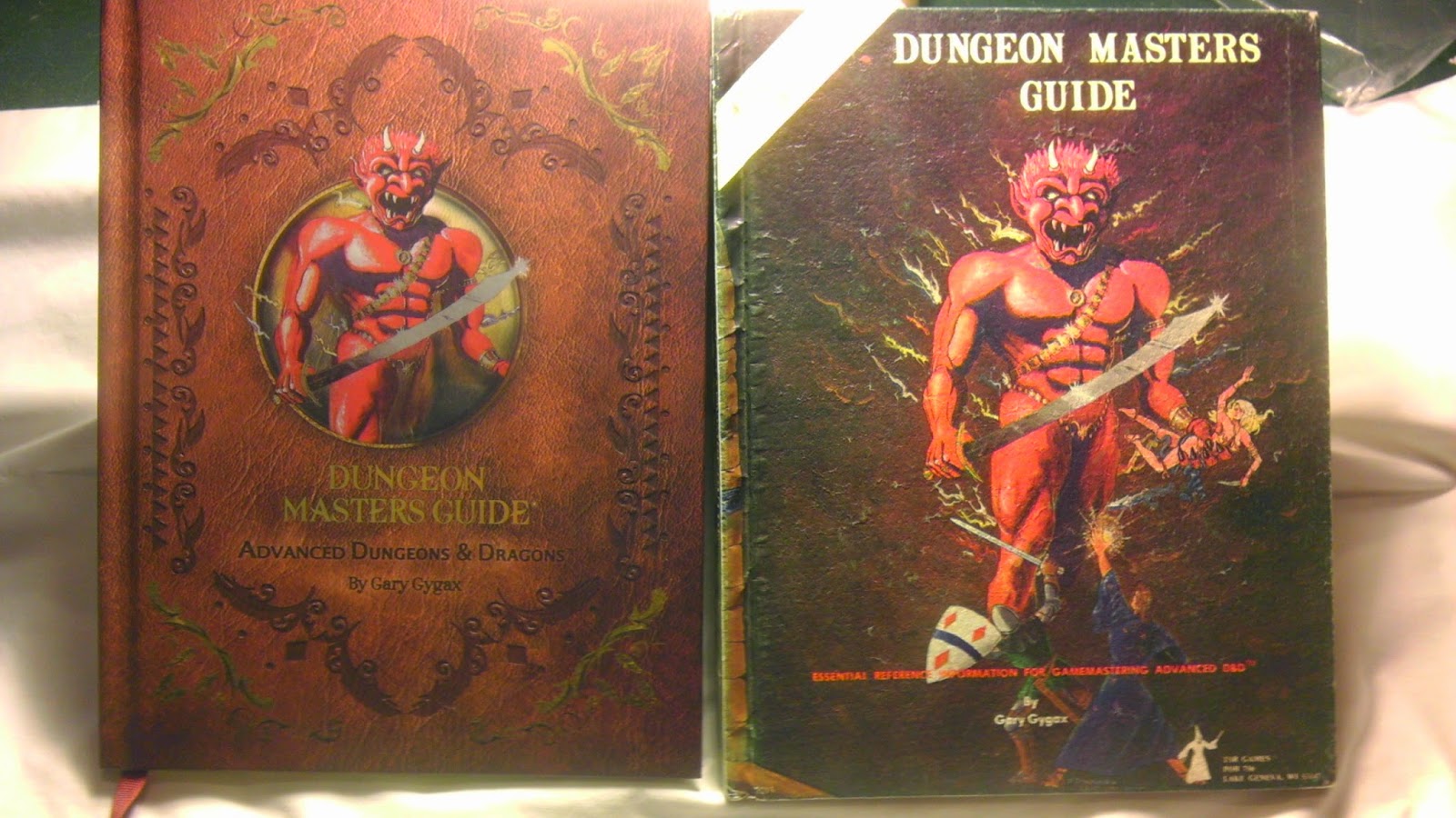 |
I apologize for how "hot" this photo is; however, the shadows of the debossing on the new Dungeon Masters Guide can be seen clearly. Also note that the "shield" tribute image in the new edition is at least 1/5th to 1/4th smaller than the size of the original "Efreet" artwork. |
 |
The new Players Handbook cover here doesn't have any truly notable features beyond the generally well-done overall job. |
Construction-wise, I personally think these books will be just as sturdy as the originals. Why? Because they're stitched, not glued to the spine. Behold!
 |
| That red cloth shows a solid construction. And yes, that is gold edging on the pages! Note the bookmark incorporated in the book's construction, too. |
Taking a peek inside, we see that the colored end-papers have been replaced with a brown end-paper stock of similar weight as the original paper.
 |
| TSR was later to switch to white for all their books, likely due to either cost or desire for uniformity, but these early editions featured the goldenrod coloring; contrast with the dark brown of the reissues. |
Now that we've got a feel for how the books are put together and
presented externally, let's have a look at the actual contents. Here's
the title page for the Dungeon Masters Guide in the reissue:
It is nearly identical to the original. Here you can see the care taken with the interior artwork. Unfortunately, it ran a bit dark, however. I'll touch more on that later. Note at the bottom, the new trademark information, and now an ISBN.
There was some concern early on about the actual alteration, either
deliberately or accidentally, of the actual content of the books. I'm
here to say that a brief perusal shows that the reissues are identical
to the originals...or are they...? Let's have a look. Below, my
true-1st edition Dungeon Masters Guide page 9:
 |
| Games Workshop, prominently mentioned. |
 |
| Games Workshop, expunged! |
...but wait...! From my workaday 6th edition:
 |
| The Games Workshop contact information, removed well before now. |
All kidding aside, a better view of subtle changes inside can be seen here, with this view of the probability distribution chart. The lower image is the reissue, the upper the true 1st (which the later prints also had).
Note the arrows? Thick and bold in the original runs; the reissue uses a
smaller, un-bolded arrow. While we're on the subject of subtle
changes, note these two paragraphs. First, the 1st print:
 |
The first sentence under The Effect of Wishes on Character Ability Scores ends with "...spells found on..."
|
Now, the reissue:
 |
| The entire parenthetical statement is on the first line. |
While the fonts appear to be the same pitch, the spacing is definitely tighter. And yet to my eyes it is at the same time clearer. I think the brightness of the new paper helps. Speaking of that, I realize I said no more construction talk but let me just say this: the paper is not glossy. It is semi-gloss, or satiny. But it does not throw back light like a slick magazine page or plasticine photo paper. It feels a bit heavier than the original paper. I'll ask Mrs. TheDungeonDelver's mom if she can tell what weight it is.
Now, one question might be, "Does this spacing affect the charts in the book?" Let's see:
 |
Here, the Age Categories chart from the 1st printing. Note spacing and font size.
|
Here's the reissue...
 |
| The same table, easily readable, not at all distorted. |
One more (very important) word on the text: none is lost in the spine. Not a single page I have seen thus far has text that runs deep into the spine. There are places where it's better than the originals, in fact. So far it is eminently readable.
A note should be made about the actual content of the books: scanning is not perfect, nor are new editors free of making the occasional error. Although I missed it on the first (admittedly ecstatic) perusal of the books, sometimes 1 (one) HD monsters are replicated as having seven hit dice. Makes those "common" dwarf types much more fearsome! It's not a huge issue, but one that should be watched for.
Now, let's talk about the interior art. First of all, as happens with many new books, it smudges. I'm pretty sure the first prints probably did when they were opened on the first day. I don't mean smudges as in just comes off on your hands when touched, but if you're going to be working from these books, don't be surprised if you do smear some black ink onto your hands (or worse back onto the page) from resting your fingers or palms on the books for a while. I'm not going to smear an image to show you, but trust me, they do.
Now, in sharpening up the art, they also darkened it considerably. This is unfortunate, as some details have been lost. Let's consider one of my friend Brian's favorite illustrations from the Players Handbook, featuring a group of demi-human explorers passing a magic mouth spell on a corridor wall... Here's what it looked like originally:
 |
| Note the arms of the adventurer holding the sword - sharply defined, easy to see. The steps proceed all the way to the eyes looking up out of the darkness. |
Now, here's the reissue:
 |
| The details mentioned above for the first printing are almost totally obliterated here. The arm of the adventurer disappears at the elbow, and the stairs terminate well before they reach where the now roundish and poorly-defined eyes are. |
This darkening of the art is endemic throughout the reissues. Remember Emirkol the Chaotic? Here he is in a true 1st-print Dungeon Masters Guide in all his evil glory:
...and here he is in the reissue:
 |
| Darker; the blacks have much more contrast. |
Here's another stark example:
 |
Several of the treasure-grabbing adventurers' details are lost in this classic image from the Monster Manual. |
Here is, for comparison, some line art:
Our
famous succubus doesn't seem to have suffered for it, and that brings me
to why this isn't a huge issue: the artwork had to "pop". It was being
printed on a different kind of paper from the best scans they could
muster, the originals having been disposed of or returned to the artists
ages ago. It is not an enormous disappointment to me. Had a different
paper stock been chosen or had the originals been on hand to use, we
might have gotten a different look for the images.
Lastly, there's the art (and advertisements) from the backs of all the books. There's still ads there:

 |
Above, the Gygax Memorial advertisement, below, the old GEN CON advertisement.
|
As to Unearthed Arcana, there's not really much more to say - it follows the conventions of the other three re-releases. We could probably argue until the heat death of the universe as to the utility and balance of Unearthed Arcana, so, instead let's focus on the physical presentation itself. The book came shrinkwrapped, but without a paper "collar" along the bottom unlike the main three rulebooks. There was no reason to keep the shrink, so I tossed it.
The cover of the Unearthed Arcana reprint follows the presentation of the previous three core rulebooks for AD&D. A faux leather cover with embossed gold leaf, and a detail selection from the original cover art. Likewise, a (black) bookmark is sewn into the binding. I was a little disappointed to see that, like the original, and unlike the three core book reprints, the binding was not cloth-stitched. Hopefully it won't suffer the same degree of fallapart that plagued the original print. Given that I've heard stories of peoples' copies unraveling on the day they bought them, I don't think that's going to happen.
Like the other prints, the flyleaf features a slightly modified layout:
 | |
| New and Old. Note the original copy on the left is nearly pristine. Don't ask me how it's stayed that way for thirty years. |
Like the other prints, the flyleaf features a slightly modified layout:
 | ||
| Wizards of the Coast logo featured prominently on the reprint; note the "current printing" of May 2013. |
I like that they note the current printing date. The endpapers are, like the main three rulebooks, a deep brown color which is nice for consistency's sake. Also it should be noted that there was no smearing of the printing, at least through casual contact. They seem to be using the same weight paper but with slightly less gloss to it. Artwork held up well. And, speaking of artwork, one major piece has been deleted:

The above image is the original plate on page 73, featuring a harpy attacking adventurers. However, in the name of "patching" the book in a major way, the reissue features this instead:

The errata! I can only assume that this was placed on the "art page" due to how it would change the interior layout and potentially create more work, so while losing the "harpy" piece was a shame, it's not as though it can't be seen all over the place as well as in the original printing. Having the errata in the book makes a big difference in terms of usability (if you're using the book regularly, that is).
In the overall, if you're a completest, Unearthed Arcana is a fine purchase. If you're buying the AD&D reprints to game with, and you're leery of adding stuff that you might find unworkable or too powerful to the game, you might want to hold off. Most internet game shops have this and the other three books deeply discounted, and they're still as plentiful as you might imagine. I haven't seen any indication that Wizards of the Coast is planning on releasing other AD&D rule-books such as the Monster Manual II, Fiend Folio, etc., although they have also released "premium" reprints of 2nd Edition AD&D, as well as regular reprints of 3rd Edition (which is a bit beyond the scope of discussion in this 'blog).
If you have the means, then by all means: pick these up with or without Unearthed Arcana.
The above image is the original plate on page 73, featuring a harpy attacking adventurers. However, in the name of "patching" the book in a major way, the reissue features this instead:
The errata! I can only assume that this was placed on the "art page" due to how it would change the interior layout and potentially create more work, so while losing the "harpy" piece was a shame, it's not as though it can't be seen all over the place as well as in the original printing. Having the errata in the book makes a big difference in terms of usability (if you're using the book regularly, that is).
In the overall, if you're a completest, Unearthed Arcana is a fine purchase. If you're buying the AD&D reprints to game with, and you're leery of adding stuff that you might find unworkable or too powerful to the game, you might want to hold off. Most internet game shops have this and the other three books deeply discounted, and they're still as plentiful as you might imagine. I haven't seen any indication that Wizards of the Coast is planning on releasing other AD&D rule-books such as the Monster Manual II, Fiend Folio, etc., although they have also released "premium" reprints of 2nd Edition AD&D, as well as regular reprints of 3rd Edition (which is a bit beyond the scope of discussion in this 'blog).
If you have the means, then by all means: pick these up with or without Unearthed Arcana.
Comments
Post a Comment